Moving from Surviving to Thriving: Mapping Documentation


Climate Change Map Data Documentation

As part of an EPA funded project, ECO-Action staff partnered with Emory University interns to create a
climate change map of metro Atlanta. The purpose of this map is to use climate change data from various
sources and visualize them in an accessible format to see which neighborhoods are at greater risk from
climate change threats. The climate change variables that are used in this map include flood risk, heat
risk, and ozone exposures. It also includes sociodemographic characteristics through income levels. The
current map work can further be expanded in the future by including for other climate change variables
and conducting more sophisticated data analysis to understand climate change risk. Users can zoom in
and zoom out of the map, select for map variables, and type in addresses to see which neighborhoods
might be vulnerable to climate change effects.

Major Data Sources 

The following two major data sources have been used in the compilation of this information. 

EJ Screen

See the link at here for additional information. 

– “In order to better meet the Agency’s responsibilities related to the protection of public health and the environment, EPA has developed a new environmental justice (EJ) mapping and screening tool called EJ Screen. It is based on nationally consistent data and an approach that combines environmental and demographic indicators in maps and reports.”

Risk Factor

See the link here for additional information. 

– “Risk Factor is a free tool created by the nonprofit First Street Foundation to make it easy to understand risks from a changing environment.”

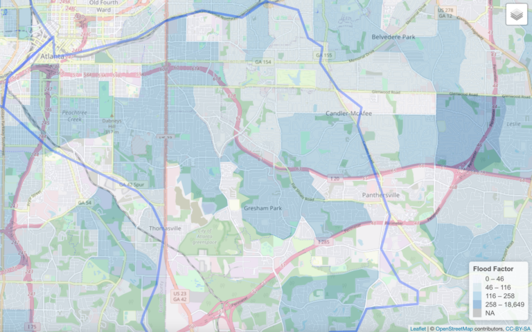
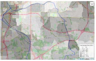
Maps of Intrenchment Creek Watershed flooding, heat, ozone and income

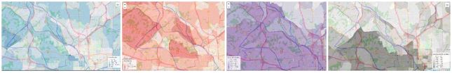
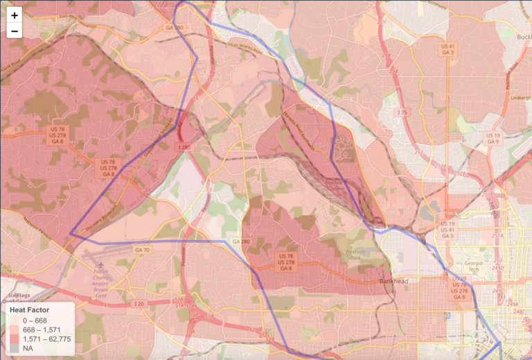
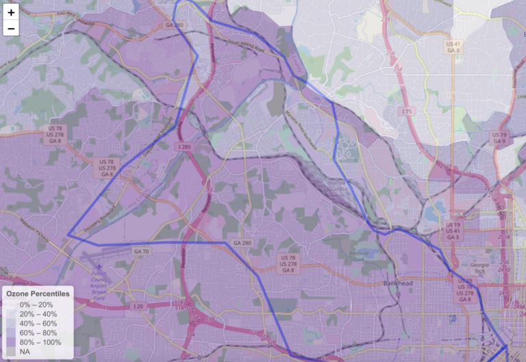
Maps of Proctor Creek Watershed flooding, heat, ozone and income

Details on the Mapped Data

Details on the mapped data illustrating flooding risk (Flood Factor), heat (Heat Factor) ozone and
socioeconomic status are provided below:

Flood Factor

  • Data Source: Risk Factor
  • Date of Data: Unknown
  • Data information: Risk Factor provided us with a list of properties of varying levels of “property risk which they define as the relationship between likelihood and depth of flooding. They divided the properties at risk into the categories of “minimal,” “minor,” “moderate,” “major,” “severe,” and “extreme.”
  • Mapping the Data: In mapping the data, we looked only at the properties that were at a “major” risk or higher for flooding. These were then divided into four even groups, where census tract or block group with 0-49 properties in the major risk category comprised the lower 25th percentile of the data, 46-116 properties being 25-50th percentile of the data, 116-258 being 50th-75th percentile of the data, and greater than 258 being 75th or higher percentile. This is reflected in the color scheme of the map where those areas with darker blue colors are the locations where there are a greater number of properties at risk.
  • Important Data Considerations: The actual Risk Factor website evaluates additional variables (ex: other types of infrastructure at risk, probabilities of flooding, etc.) which they consider into their model to assess flood risk for a neighborhood. Therefore, the information illustrated in this map might not be identical to the information shown on the Risk Factor website.
 

Heat Factor

  • Data Source: Risk Factor
  • Date of Data: Unknown
  • Data information: Similarly, Risk Factor provided us with a list of properties of varying levels of risk from heat, which they define as the different temperatures the properties are exposed to at the hottest month of the year. They divided the properties at risk into the categories of “minimal (<80),” “minor,” “moderate,” “major,” “severe,” and “extreme (104+).”
  • Mapping the Data: In mapping the data, we looked only at the properties classified under the “major” risk or higher for heat. These were then divided into three groups, where census tract or block group with 0-668 properties in the high risk category being the 0-50th percentile of the data, 668 – 1,571 properties being the 50th – 75th percentile of the data, and greater than 1,571 properties being the 75th or higher percentile of the data. This is reflected in the color scheme of the map where those areas with darker red colors are in the locations where there are more properties at risk.
  • Important Data Considerations: As noted previously in the discussion of flood factor, Risk Factor evaluates many other variables (ex: other types of infrastructure at risk, probabilities of flooding, etc.) all of which they use to assess heat risk for a neighborhood, so the information illustrated on this map might not be identical to the information shown on the Risk Factor website.
 

Ozone

  • Data Source: EJ Screen
  • Date of Data: 2020
  • Data information: Ozone values are derived from 2018 source data from EPA’s Office of Air Quality Planning and Standards (OAQPS), Non-attainment areas (NAA). The ozone levels represented are the summer seasonal averages of daily maximum 8-hour concentration in air.
  • Mapping the Data: Ozone percentiles were divided into 5 even groups. The higher the level of ozone, the darker the purple color shown on the map.
  • Important Data Considerations: Ozone values shown on the map represent the averaged maximum 8-hour concentration during the summer season in 2020. While ozone generation is highest in the summer when temperatures are highest, the relative ozone levels in various geographic regions could differ seasonally and at various times of day. Relative ozone levels might also vary from year to year. 
 

Socioeconomic Status 

  • Data Source: EJ Screen 
  • Data of Data: 2020 
  • Data Information: The socioeconomic data source is U.S. Census Bureau’s American Community Survey (ACS) 2016-2020 5-Year Estimates (ACS 2020). 
  • Mapping the Data: Low income percentiles were divided into seven groups. The higher the lower income percentile, the lower the income of the community. On the map, as the lower the income on the community, the darker the gray color on the map.  
 
Other Mapping Notes

Details on the actual coding of the map project can be found in the R Markdown File which may be available upon request. Data was mapped using R with open street maps and the “leaflet” package.  While these four indicators give examples of the types of climate change threats that could be mapped, this project can be further expanded to include other variables and delve more deeply into existing variables for a more accurate analysis of exposure and risk.